Monday, 10 October 2011

6. Evaluation

Evaluation:
Since September I have looked at magazines, first, I created an idea for a school magazine and developed the cover as a preliminary task, then went on to research institutions, media theories and finally, magazines fitting to my music genre of choice. Over this time, I have been working on developing my own magazine cover, contents page and double spread article for a music magazine.

1. Forms and ConventionsMy magazine both challenges and develops certain forms and conventions of the industry throughout the composition of my texts. Although my magazine focuses on a somewhat new genre thus having little information or texts about it, my work was inspired by a variety of photos, magazines and their conventions, which helped me produce this magazine.

For example, my cover maintains a regular layout: using headers, a masthead at the top with main image protruding it, flashes, prices, included articles and a tag line. This makes it appear professional and knowledgeable of usual magazine covers. Similarly, in my contests page and double spread article I employ techniques used within magazines, my contents has taken direct inspiration from mainly fashion magazines rather than music. I feel like this would give the impression that my magazine is fresh, clear and stylish, this would be important to my readership it is a genre which aesthetics are very significant.
                                                                                                                                                                 

My magazine also challenges some usual conventions with in it, such as on my front cover, the singular main image is not centred unlike most magazine covers this may look unusual and attract interested new readers. By doing this with the image, it is also defying a common rule within composition of keeping a space on the left third of the page. By making this rule the reverse of usual it would seemingly break norms of some other magazines and once again be eye-catching to a passer-by .


2.Representations of Social Groups
When I created
 my model's characters as musicians, I was hoping to reflect a darkwave vibe without being strictly 'gothic' or 'alternative' like other magazines. I used a lot of purples, blacks and blues with a foggy type of effect to mirror the aestethics of the genre (in album and fan art, etc.) I feel I may not have represented my band in the way most media does, in the article. Many magazines imply that bands live too much of a "rockstar" lifestyle with drugs and alcohol, and although I mention the duo both being seemingly hungover, I describe them as friendly, if not a little unusual, also. I think this may represent the social groups of creative, student types within my target age groups.

3. Distribution After researching  the main magazine publishers , I found that 90% of magazines published in the UK are published by:
  • IPC media
  • EMAP
  • Dennis
  • Conde Nast
  • National Magazine Company.

I think the magazine publisher that would be best for my magazine may not be a well-known publisher as it might be considered a specialist magazine. I imagine if a magazine like mine would stand as an individually published magazine or fanzine it would call in the correct target market. However if one were to publish my magazine I think a publisher like Bauer could as although it issues popular and varied magazines, it does although print a lot of magazines for specific markets varying from mother and baby magazines to exclusive motoring magazines. However under the category of ‘men’s entertainment’ they only have KERRANG!, Mojo and Q, which- other than KERRANG! are focused mainly on popular music in general. Bauer might want to invest in publishing my magazine as it would bring a completely new market for them and help expand their music category of magazines.


Alternatively, a slightly less publisher may want to publish my magazine such as the company Condé Nast, the US based publishers focus on mainly ‘up market’ magazines, with their main focus on luxury fashion, printing Vogue, Glamour and GQ but have also broke up of into home, bridal, food, travel and technology. They may want to expand into music magazines also.

4. AudienceBy looking into fans of witch house music on last.fm and similar websites, I came to a conclusion that my target audience was fans seemed to be possibly a 60:40 mix of males to females; their ages seem to average around 19-28. They tend to be mainly from England, America or Slavic countries and into a variey of other dark and experimental genres of music. I tried to reflect this in the language I used.

5. Media Technologies

Throughout the process of creating my magazine, I have learnt that the production of a magazine uses a larger variety of technologies than I had first imagined. I have used Photoshop at most stages of production, whether that be to slightly edit photos or make my contents page. I also used Serif Photoplus, similar to Photoshop, I preferred this to create my cover as selecting layers was easier and it was less complicated to get access at home. As well as this, I used Serif Pageplus and Adobe InDesign, software which I had never used before, to create my double page spread, I became more confident in making my article and experimenting different compositions. In the early stages, 
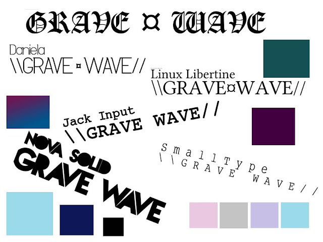
when researching typesets DaFont.com was a very important tool to me, although I ended up using a reasonably basic font, it gave me a greater understanding at which fonts work with different genres. Of course I used the Internet: ( both Internet Explorer and Google Chrome) to explore and research various sources throughout the course, I have learnt the importance of how reliable a text if before using it within my work, also I have used this website, Blogger as a tool to track or log my progress throughout the year as a diary as such to understand each process I have gone through.


As well as these, I have used my digital camera, Canon PowerShot A560, to take the photos for my magazine. I have learn passed my former basic knowledge of this. It produced high quality pictures for my photo sets, although the resolution is not the best, I think this helped my magazine as the slightly grainy and pixelised look is used a lot throughout the genre of witch house .

6. Personal Progression

 
Since my preliminary task my skills of using have increased greatly, although I had a basic knowledge of programs such as Photoshop and was aware of layouts/composition of magazines in my preliminary task, it’s obvious I was not yet fully accustomed to the programs used or some of the media conventions. My skills in editing and photos and typesets has increased significantly, as have my understandings of the industry.

I feel my magazine looks more professional and that I have became more confident in editing photos and experiment with colours and special effects. I have become more able at noticing reoccurring colours and trying to incorporate them into the cover as a theme for example I have uses the hint of lilac and purple within my background and drawn it to the masthead and main article to look more flowing; whereas my school magazine only very loosely holds the theme of orange and white. 


I feel that although I had a knowledge of magazine layouts, how I used these tools did not accurately reflect how the media uses these and looks quite amateur. Whereas I think in my final piece the use of programs and conventions portrays my improvement over the months. My progression is apparent from the preliminary task to my final text and that it is evident just throughout my covers.

5. Production Process

Creating my magazineI went on to develop my contents page, I made the title using the same effects and font as I had to write my masthead, so it would fit in with the composition I stylized with a '//' at the front to suit the kind of ASCII and symbols theme that my chosen genre of music used often.


Getting inspiration from various found images, I decided I’d make my mine a simple and minimal double spread contents page. I split the articles into three sections: 'On the cover', 'Every month' and 'This month' and left a space for a small picture of the cover and message from the editor like I had seen in many similar contents pages. I put my main article at the top with a space for an adjoining photo, on there I would write the page number for it. I also included a border at the bottom of the page.

Final draft of contents layout (click to enlarge)
Next, I used a photo I had taken from a gig last year, of a silouette of a person in the fog. I thought this worked well with my theme and changed the colours a little with a colour overlay and altered the contrast to suit the genre a little bit more. I decided it would be a good picture to use as the read can't tell the picture is of a specific artist, and therefore works well as a general picture for the contents page.

I stretched the image across, and also changed the colours of page number to suit the colour palette of the page.
Final contents page (just need to add a picture of cover and a photo linking to main article)

Not yet having my main photos of the "band", I decided to make a photo of the album cover which I could include in my main article. I took a picture in town of a bird in a tree, as the sky in the background almost looked completely white, I thought it would a easy to edit.

I used PhotoPlus X4 at home to begin altering it, I used the hue to make the sky appear a pink/purple colour and changed the contrast and lightness with the curves to make the bird and branches of the tree to seem darker.


I then added the text, I decied to use a typeset similar to the Old London font I included in my mood boards. I hoped to include this at the bottom of my main article with album release information beneath it.
OKVLTA's "debut EP" album art.


Once I had the raw images I could work on editing them - which I did mainly on PhotoPlus X4 – and add them to my textsand make the final additions. I experimented with a few images, changing the contrast, hue and generally making them suit the genre by colour overlays and glitch-effects:


I selected around my models and deleted the background then put in the previous tree photo behind them, used curves to brighten and add contrast to the photos and blurred around the image to make it appear softer.


For this one I just edited the contrast, put a blue colour overlay and experimented with the curves a a bit.


In this photo I really tried to encoroprate elements of the genre which I had noted whilst making my mood boards. Firstly I created a duplicate layer of the image and dragged it slightly to create a shadow or 3D effect. Then I turned up the contrast to its heighests and made the bacgrond of the photo slightly opaque. I added an extra layer which was just grey and turned the noise up and zoomed in and stretched it to create a TV static appearance.
When taking photos I experimented with many different props, shots and places. I also took individual photos of my models which I would have liked to add to my texts, however there was not enough space for them to have one each.


4. Design Process

Mood-boards
After researching music magazines, I had to start designing the mock up for my own music magazine. My musical genre of choice would be a sub-genre of mostly electronic music called ‘witch house’. Although it is a reasonably new movement, I thought it would be a good choice as it has very distinctive visual style and there are no magazines specifically for that genre as of yet.
 Witch House’ is a mostly electronic music movement of 10s, found of memory manipulation, which typically incorporates elements of hip hop, dubstep, electro, gothic, shoegaze and ritual ambient/ethereal/noise/drone music often with a slow tempo and a lo-fi aesthetic meant to evoke a dark, sinister, occult or juancarlitos mood.
Witch House is also influenced by hazy 1980s goth bands, including Cocteau Twins, The Cure, Christian Death and Dead Can Dance, as well as being heavily influenced by certain early industrial bands. Many artists in the genre have released slowed-down remixes of pop and rap songs, or long mixes of different songs that have been slowed down significantly. Common typographic elements in artist and track names include triangles, crosses and other geometric shapes.'

Source: last.fm

I made a few mood boards to collect images and ideas for inspiration.

This one is mainly looking at the features of bands associated bands/artists and symbols.

On this one, I focused more on the imagery of the album art, band logos and other photos within that scene.


From collecting images from these mood-boards, I've realised that they use a considerable amount of purples, blues and pinks, and hazy, foggy or purposely blurred/digitally altered to give it a 'mysterious' feel. They also use a lot of religious imagery; such as crucifixes and The Star of David or their excess amount of Satanist/Wiccan/Pagan symbols for instance pentagrams and runic symbols, which gives feeling of 'the unknown' or somewhat occult. Also adding to their 'mysterious' appearance.


Some lesser know names of the genre mention hybrids of new-wave, I thought as it encapsulates that genre, but darker, Grave seemed fitting. As for the slashes and symbol, they are just for aesthetic reasons.
After exploring the visual aspects of the musical genre, I saw they usually stuck to using either simplistic/serif or Gothic style typography. I considered different typesets and colour palettes associated with witch house visuals: :
                                 :


Focusing back on magazines, I tried to find a few magazines which suited my genre and that I liked the look of, seeing as there weren't any superficially Witch House/Drag music magazines about, I just focused more on which sort of composition I thought would work well for my magazine.


I found that, personally, I was more drawn to minimalistic covers, with not too many flashes, articles or puffs. I generally prefer simple typesets, and think that would work well within my magazine.
Mock ups
After taking inspiration from my mood boards and other images I had collected, I started to begin the design process; first I started on creating my masthead. I decided that though the type sets I had chosen fit within my genre of music; most were either too thin or, in the case of the gothic font 'Old London', too detailed and busy for to be the masthead. I needed something bold, so I went with the type set ‘Nova Solid’ and edited it a little until I was happy with it.

I cut out the middle of the text, leaving only the outlines. Then I took to Photoshop and used the FX such as drop shadow, outer shadow and bevel and emboss. I also experimented with whether to leave my masthead black and white or coloured with a gradient. In the end I left it to see which of my main images I used and what suited it best.


I used similar techniques with the FX bar to create different flashes for my mock ups and wrote up my article titles and banner in MS Word (so that I could write in the appropriate symbols – Photoshop wouldn’t let me) and dragged them into Photoshop. After adding the date, issue number and barcode I was ready to start experimenting with my composition:

My first mock ups (the gradient colour background is just for now)
Although when doing my research for my mood boards, I decided that I like quite minimalistic covers that do not always follow magazine conventions. I think that using a masthead 3/4 of the way down the magazine may confuse the reader into mistaking the masthead for the main article, for that reason I think I'll avoid that idea. Similarly with my second mock up, putting all the band names/ articles to the bottom of the magazine may be a little risky and make the cover look a bit amateur, even though I like this look, it may be something that only already well known magazines can get away with. But I decided I'd still attempt to experiment with the composition when I had my main image.

Next I went to the production process of my magazine


3. Target Audience

The possible style of my target audience
All media products will have a particular target audience that they are aiming at; they specify this in many different ways: age, class, income, demographics and gender identity. As well as this, they can vary who they aim by looking at their target market’s interests and style of dress code for that group of people. After choosing my genre of witch house/drag music I realised it being a reasonably new genre it would be hard to specify a kind of person which would be my target audience. I decided to research what types of target market various music genres and thus music magazines aim at to help my understand how to specify more exactly who my target audience would be.


For example, the popular magazine NME is aimed at both genders although their readership is at 65% males. Their target audience varies from ages 16 to 34,
half being aged 16-24, average age being 24. The magazine is more focused on popular indie and rock than other music, and they dress appropriately, usually suiting the dress code of bands they listen to. 45% of NME agree that they spend a lot of money on clothes and a huge 71% agree it is important to look well dressed. I think a lot of NME would buy clothes from shops such as Topman and Burton. They manage to cater for their audience by including advertisements and of course articles which appeal to them. Their adverts could be for clothes from stores mentioned above or games and food, as other than music and clothes this is what they agree to spend most time or interest in. The food they would advertise are usually snack food or things quick to eat as that is associated with student lifestyle.


Whereas the statistics are very different for a magazine such as Top of the Pops’readership are 85% girls and the age range usually falls between 11-15 years, obviously not yet having an income. The magazine looks at popular music and celeb stories and television which the readers will most like also are interested in. It focuses strictly on pop music, very much youth orientated with the use of cheesy lyrics and catch rhythms. They also use this language within their articles, and slang used by girls of that age to relate to them more such as teen jargon ‘fit or ‘phwoar’ looking at male musicians as a object or desire and women as a source of inspiration. They use bright colours on the cover to appear cheery and friendly, the use of pinks and purples are very much based on who their target audience are – young girls. Not having their own income, their clothes tastes based on that their parents would buy them, usually. The advertisements would be strictly for BBC products and television as it made by them. They would possibly by things from shops such as Claire’s Accessories etc.


A contrasting magazine would be Metal Hammer, which focuses mainly on genres within metal music, but also hard rock. 82% of their readership consists and readers are aged between 20-39. The music is portrays as quite aggressive and has violent connotations, their covers focus a lot on this, using images containing a lot of blacks and reds.  It can also be seen not just a music magazine, but a lifestyle one too, as it conveys an image of alternative style and include news on musicians life as well as their music.  
Adverts in Metal Hammer are shown to be a significant influence on readers' purchasing, with 59% having bought products and/or services advertised in Metal Hammer and 54% have discussed an article or feature with another person. The advertise alternative clothing brands and possibly films, as well of course new music releases.
As there are very few magazines specifically looking at my chosen community for music, I had to research witch house fans myself, I looked both for facts and statistics, as well as finding possible links and making assumptions based on these. I began to look over statistics on http://last.fm from listeners of certain witch house bands looking at their age, gender and where they live as well as their favourite bands and genres of music, on their profile. From this I found fans of witch house music seem to be possibly a 60:40 mix of males to females; their ages seem to average around 19-28. They tend to be mainly from England, America or Slavic countries. There seems to be a link between witch house fans and other dark, experimental genres or music, such as chillwave, ambient and alternative, originating from the eighties.
Quite a lot of witch house bands collaborate with online stores which also have other designs not relating to the music specifically to sell their merchandise for example http://nvrmind.bigcartel.com has a collab section. From this I feel might wear a lot of the other clothes on it, leaning towards a dark, alternative dress, mainly blacks and whites, focused on glitch edited art and, like the genre itself, symbols.  

Nvrmnd's "∆CID H∆ND"
http://www.axelspringer-mediapilot.de/dl/494684/METAL_HAMMER_Ratecard_2012_e.pdf

2. Research

Magazines

Magazines are publications, usually published on a regular schedule, containing a variety of articles or reviews. They are generally financed by advertising, a purchase price or pre-paid magazine subscriptions. There are many different types of magazines, from weekly, monthly, quarterly and annually. Magazines now come in a variety of genres, for specific areas, interests, hobbies and lifestyles.

An example of the selection of magazines on sale.
Most magazines have similar format:
Format of magazine
(click to enlarge) 
History of magazines


In 1586, Josse Amman, a Swiss painter, published magazine on the fashions of the day, with the title ‘Gynasceum sive, Theatrum Mulierum’. It is thought to be the first fashion magazine. In 1693 John Dunton published The Ladies Mercury’ a periodical specifically for women, including an advice column. He later published The Athenian Mercury’ which audience was both men and women; it included articles on love, religion, science etc. Although these are considered some of the earliest forms of magazines, they are not as we know them now, there were rarely any pictures or illustration, some could say it resembles what we would know as a newspaper now.
The first magazine in the form we know it was ‘The Gentleman's Magazine’,published in 1731, London, it is considered to be the first general interest magazine. Edward Cave, who edited The Gentleman's Magazine under the pen name "Sylvanus Urban", was the first to use the term "magazine". It contained general news and a variety of topics Cave thought the educated reader would be interested in; from commodity prices to Latin Poetry. The magazine stopped printing in 1922.

The Scots magazine: Past and Present
The oldest consumer magazine still in print is The Scots Magazine, which was first published in 1739, though multiple changes in ownership and gaps in publication totalling over 90 years weaken that claim. Lloyd's List was founded in Edward Lloyd’s England coffee shop in 1734; it is still published as a daily business newspaper.
.

Music Magazines
During mid 19th Century, a number of music periodicals emerged giving composers a chance to circulate their music to a large number of other musicians and music fans. Publications such as ‘The Musician’, ‘Perry's Music Magazine’and ‘The Echo’ were quite popular at the time, however most did not last long and consequently. Possibly, one of the most well known US music publications from that time is ‘The Etude’ published continuously by Theodore Presser & Co. from 1883 till 1954.
<><><><><><><><> <><><><><><><><>
The Etude through time (1883, 1921 and 1954).


Evolution of the composition
Just from these examples, we can see how music magazines in particular have stared to evolve, first, starting with simple, text based cover, with possibly a few embellishments around the side. Later, we see one central image, on a simple cover, and finally, in the last year of production, here, we see a central image, taglines and mention of other featured articles.


Since then, music magazines have become more adventurous with their composition, and colour palette. A good example of this is New Musical Express (NME). NME is a popular music publication in the UK. Published weekly since March 1952. In the 1970's it became the best selling British music magazine.

NME change to blue to celebrate
Primal Screams 20th anniversary.


At first their composition is once again resembling a newspaper, later on their look evolves to a central image, with a mention of the main featured article.


Later on, in the late eighties and early nineties, NME become more experimental with their composition, including more than one image, flashes and other featured articles. Now, in the in the 'noughties' and 'teens', NME are aware of of how much of a popular established brand they are; they feel comfortable enough to change their well-known iconic red masthead to other colours some weeks to better suit the colour palettes of that cover.


Publishers
 Magazine publishers are the companies that prepare, print and issue the magazine for public sales. Many magazine publishers print a lot of varying magazine genres.

For example, one of the biggest magazine publishes is the worldwide Bauer Media Group based in Hamburg, Germany. Founded in 1875, they operate in 15 countries. They work in publishing print and digital magazines. Worldwide circulation of Bauer Media Group's magazine titles amounts to 38 million magazines a week.
At the beginning of 2008, Bauer expanded its portfolio by acquiring Emap’s Radio and Consumer Magazine divisions and changed the name of these new UK businesses to Bauer Media.
With the recent addition of the former Emap Consumer Media titles, Bauer is now the largest consumer magazine publishing company in the UK, playing a primary role in the Women’s Weeklies, Women’s Interest, Women’s Lifestyle, TV Listings, Puzzles, Men’s Lifestyle, Music & Film and Specialist magazine markets.

They publish magazines varying from the likes of Bella, Zoo, Kerrang, Classic Bike, Closer and many more.

Another notable publisher is UK based company, IPC Media (formerly International Publishing Corporation)  is a consumer magazine and digital, with a large portfolio selling over 350 million copies each year. It was founded in 1958 and is based in London. It produces magazines for what they see as three audiences; men, mass market women and up market women. It splits into suitable groups of publishing; IPC Inspire, Connect and Southbank.
Their portfolio IPC Inspire comprises a wealth of leisure brands aimed at men including Country Life, Horse & Hound, Rugby World and Decanter, as well as lifestyle brands including Nuts, Mousebreaker and NME.

Whereas IPC Connect (their division aimed at mass market women) comprises well known women's weeklies including Look, Now, Chat and TV entertainment brands including What's on TV, TVTimes and TV & Satellite Week.

And lastly, IPC Southbank, caters for their audiences of upmarket women comprises of luxury fashion brands including Marie Claire and InStyle, lifestyle brands including woman&home and essentials and home interest brands including Ideal Home, Livingetc and housetohome.