After
researching music magazines, I had to start designing the mock up for my own
music magazine. My musical genre of choice would be a sub-genre of mostly
electronic music called ‘witch house’. Although it is a reasonably new
movement, I thought it would be a good choice as it has very distinctive visual
style and there are no magazines specifically for that genre as of yet.
Witch
House is also influenced by hazy 1980s goth bands, including Cocteau Twins, The
Cure, Christian Death and Dead Can Dance, as well as being heavily influenced
by certain early industrial bands. Many artists in the genre have released
slowed-down remixes of pop and rap songs, or long mixes of different songs that
have been slowed down significantly. Common typographic elements in artist and
track names include triangles, crosses and other geometric shapes.'
Source: last.fm
I made a few mood boards to collect images and ideas for inspiration.
 |
| This one is mainly looking at the features of bands associated bands/artists and symbols. |
 |
| On this one, I focused more on the imagery of the album art, band logos and other photos within that scene. |
From collecting images from these mood-boards, I've realised that they use a considerable amount of purples, blues and pinks, and hazy, foggy or purposely blurred/digitally altered to give it a 'mysterious' feel. They also use a lot of religious imagery; such as crucifixes and The Star of David or their excess amount of Satanist/Wiccan/Pagan symbols for instance pentagrams and runic symbols, which gives feeling of 'the unknown' or somewhat occult. Also adding to their 'mysterious' appearance.
Some lesser
know names of the genre mention hybrids of new-wave, I thought as it
encapsulates that genre, but darker, Grave seemed fitting. As for the slashes
and symbol, they are just for aesthetic reasons.
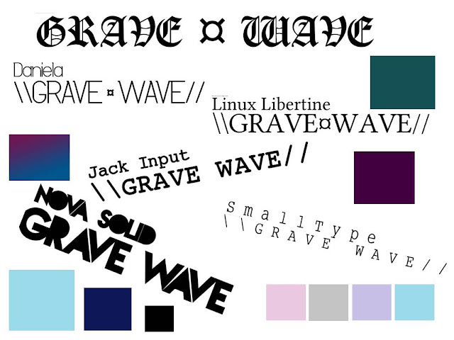
After
exploring the visual aspects of the musical genre, I saw they usually stuck to
using either simplistic/serif or Gothic style typography. I considered
different typesets and colour palettes associated with witch
house visuals: :
:
Focusing
back on magazines, I tried to find a few magazines which suited my genre and
that I liked the look of, seeing as there weren't any superficially Witch
House/Drag music magazines about, I just focused more on which sort of
composition I thought would work well for my magazine.

I found
that, personally, I was more drawn to minimalistic covers, with not too many flashes, articles
or puffs. I generally prefer simple typesets, and think that
would work well within my magazine.
Mock ups
After taking inspiration
from my mood boards and other images I had collected, I started to begin the
design process; first I started on creating my masthead. I decided that
though the type sets I had chosen fit within my genre of music; most were either
too thin or, in the case of the gothic font 'Old London', too detailed and busy
for to be the masthead. I needed something bold, so I went with the type
set ‘Nova Solid’ and edited it a little until I was happy with it.

I cut out the middle of the text, leaving only the outlines. Then I took to Photoshop and used the FX such as drop shadow, outer shadow and bevel and emboss. I also experimented with whether to leave my masthead black and white or coloured with a gradient. In the end I left it to see which of my main images I used and what suited it best.

I used similar techniques with the FX bar to create different flashes for my mock ups and wrote up my article titles and banner in MS Word (so that I could write in the appropriate symbols – Photoshop wouldn’t let me) and dragged them into Photoshop. After adding the date, issue number and barcode I was ready to start experimenting with my composition:
 |
| My first mock ups (the gradient colour background is just for now) |
Although when doing my research for my mood boards, I decided that I like quite minimalistic covers that do not always follow magazine conventions. I think that using a masthead 3/4 of the way down the magazine may confuse the reader into mistaking the masthead for the main article, for that reason I think I'll avoid that idea. Similarly with my second mock up, putting all the band names/ articles to the bottom of the magazine may be a little risky and make the cover look a bit amateur, even though I like this look, it may be something that only already well known magazines can get away with. But I decided I'd still attempt to experiment with the composition when I had my main image.
Next I went to the production process of my magazine
Next I went to the production process of my magazine
No comments:
Post a Comment